ETHEREAL RUNE TRILOGY
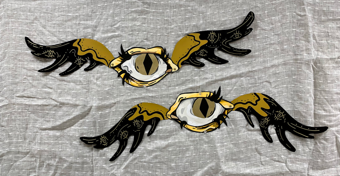
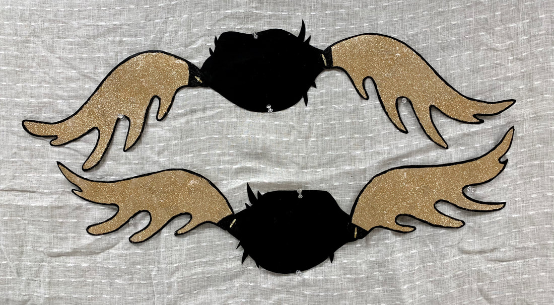
The Eyes
arranged here 40 x 20 inches
each eye is 30 x 8 inches
arranged here 40 x 20 inches
each eye is 30 x 8 inches
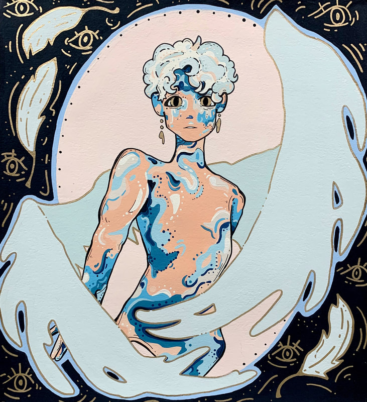
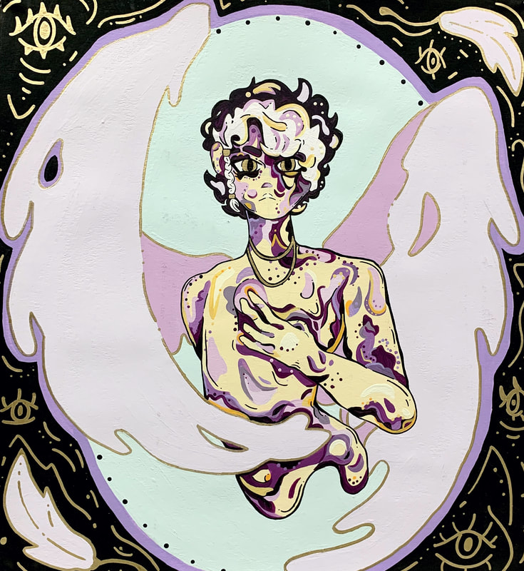
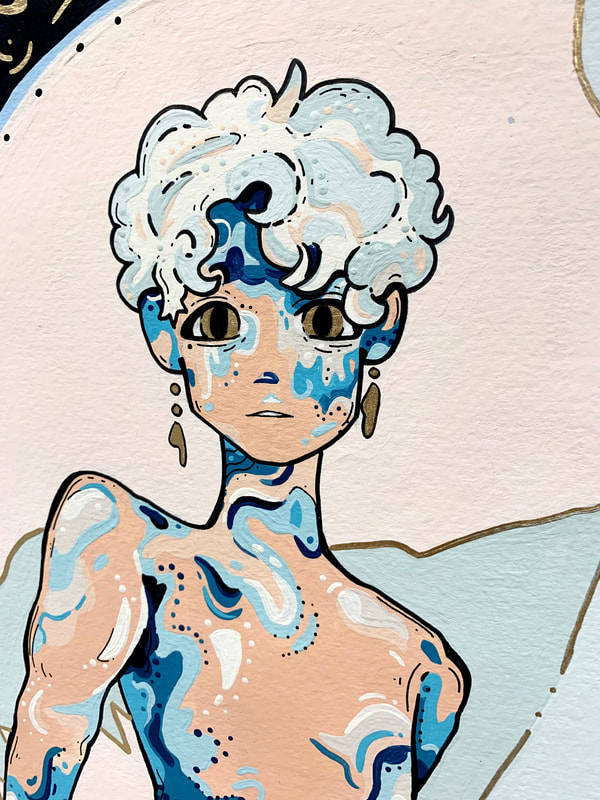
Peace
16 x 15 inches
16 x 15 inches
|
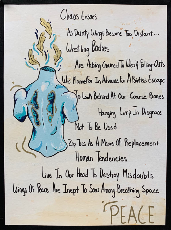
Peace
Accompanying Prose 12 x 9 inches |
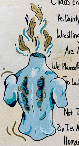
Peace
Accompanying Prose Detail |
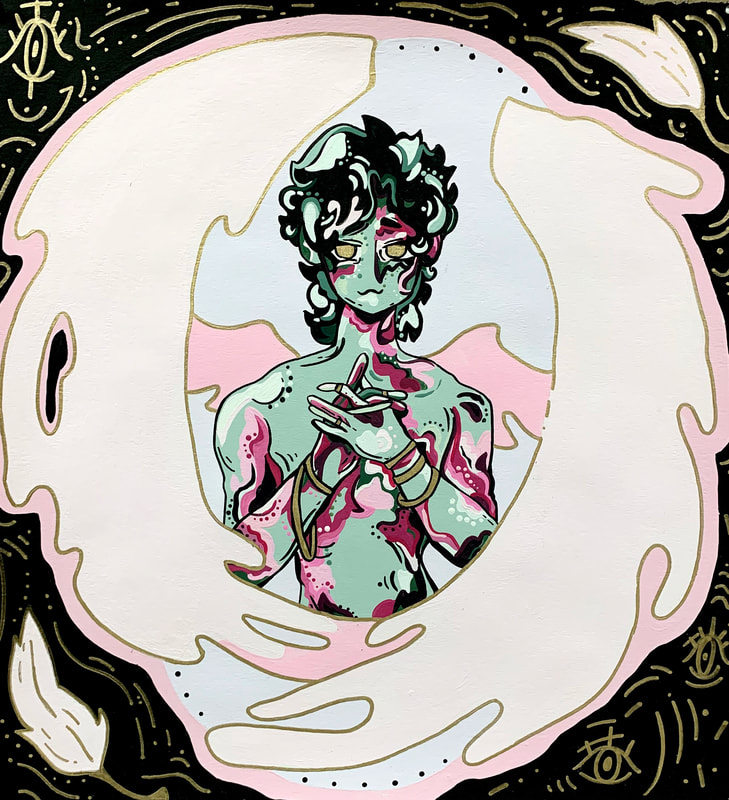
Endurance
16 x 15 inches
16 x 15 inches
|
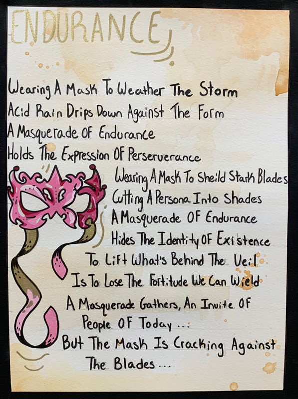
Endurance
Accompanying Prose 12 x 9 inches |
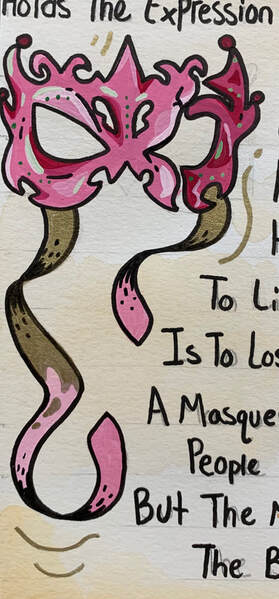
Endurance
Accompanying Prose Detail |
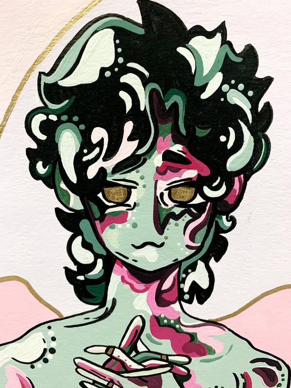
Justice
16 x 15 inches
16 x 15 inches
|
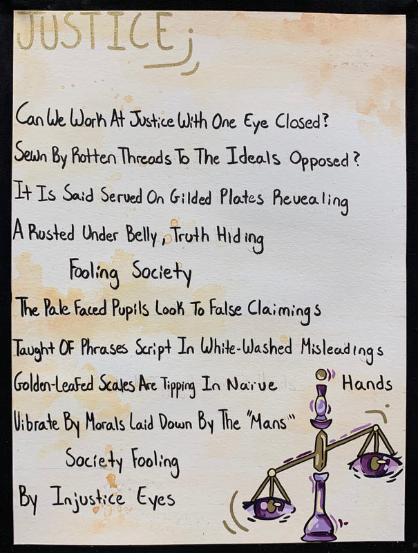
Justice
Accompanying Prose 12 x 9 inches |
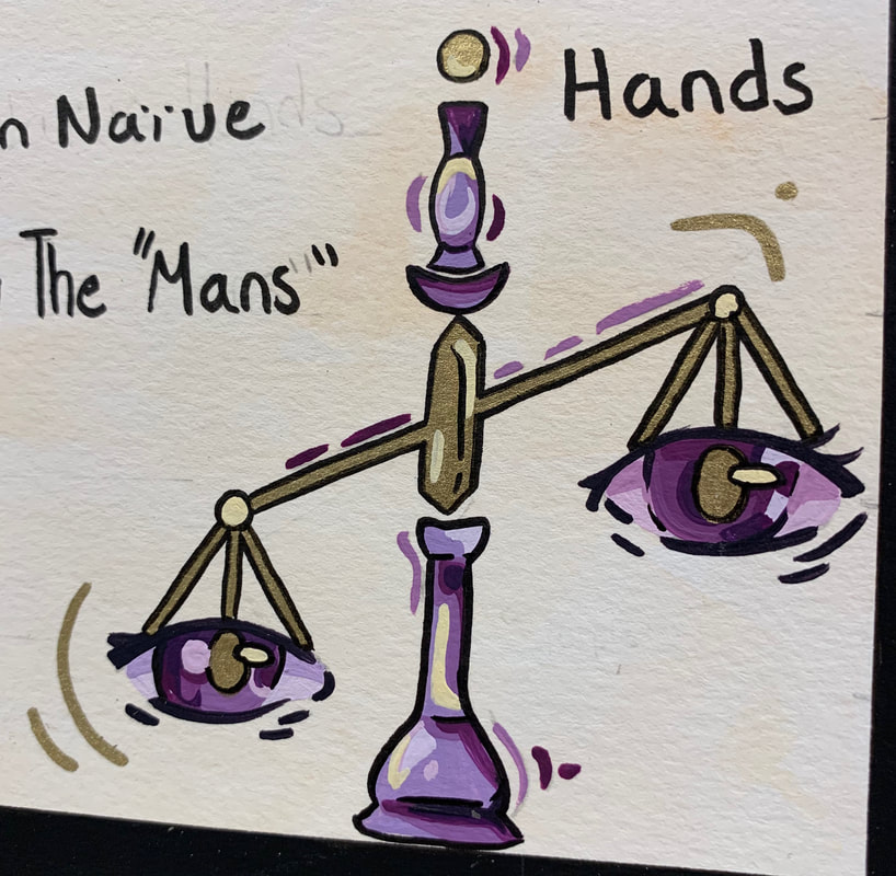
Justice
Accompanying Prose Detail |
ARTIST STATEMENT + BIO
|
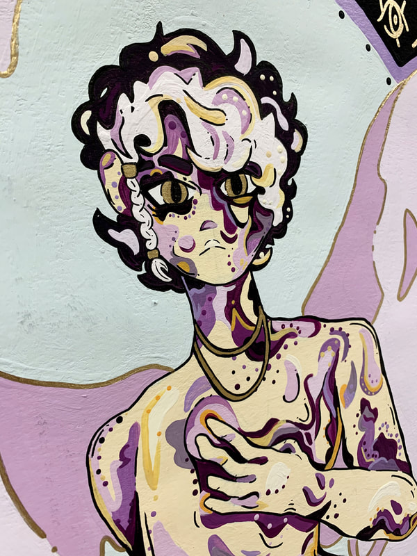
When it comes to my artist side, there is no purpose and no set inspiration for when I create art. In relation to this series it began with a one off piece; a stand alone artwork that is not part of a series. The piece titled Peace was the catalyst for the rest of the trilogy. I am obsessed with character building, development and design. The more I thought of the character in Peace, the more I thought about supporting benevolent beings; hence Endurance and Justice came to existence. There is no set reasoning to these beings, other than they are to embody virtues that humanity lacks. I feel like 2020 has truly tested humanity in their morals of peace, endurance and justice. These ethical concepts have been exposed to the light, where they previously rested in the dark. That is why I choose the bare bodies of angels, representatives of all that’s in the light, to lay naked in front of the viewer, a human themselves.
I’ve decided to include accompanying poems, for each piece respectively, that can elaborate on the qualities represented in each artwork. The three angels have their own separate identity and aesthetic with each individual personality embellished through my poems. Word choice is definitely something I love to play around with. Just the thought that words with the same meaning can have a different impact on a viewer is thrilling. You are able to change the vibe of one writing with a simple change of a word. My poems are not your traditional ABAB rhyming standard as I am encouraged to let them move to their own rhythm because structure is not my thing. My poems demonstrate that words should be able to flow on their own; wild and free while without any rules. I chose to work primarily in paint because I wanted a graphic design layered look to them. I love big blocks of just pure and opaque colors, bold and bright colors stacked on each other creating dimension. And instead of going the digital route I went with acrylics for my main pieces and a watercolor background for the poem pieces with acrylic details. Each of the three characters has a set pairing of complementary colors with a twist to them. For instance blue/orange became aqua/peach or yellow/purple became sunshine/periwinkle. I didn’t want to go with the predictable or prime shades of these colors because that was too unoriginal for me, so I spiced it up. I wanted to use some material that would be easily able to layer on top of eachother to give an illustrative look. I felt like acrylic paint would offer me this solid bold color I was searching for. With this series of artwork I wanted some semblance of divinity and a god/dess-like essence emanating from them so I used Golden metallic marker on the wing outlines and for the finer details. The hint of gold is representative of these heavenly themes and often relates to extravagance, riches, higher ideals, wisdom and enlightenment. The gilding elevates the mundane, creating something almost holy for the viewer to absorb depending upon where they stand as the shades shift. I chose to work on watercolor paper for a main reason that I like how acrylic paints sit on it. To me the paints seem to stick to the watercolor paper more easily. When the tooth of the paper is more rough I enjoy playing around with the more coarse surface texture. I had no idea, once again, that the concept of Peace would be turned into this entire series. The initial concept for this piece was on an exploratory whim. I was never looking for some great awakening within the souls and hearts of an individual yet the notion presented itself. My work isn’t meant to be created for the overall population to gain some greater reaction than it needs to be. If all I get from someone viewing my work “These are some pretty colors” then I’ve done my job. If someone wishes to peel back the fold to search for a deeper meaning, go ahead. But I have no encouragement for someone to do so. Art is art, and holds many meanings within it, so instead of arguing on what I choose my viewers to see these pieces, I choose to let it have a meaning for them. |
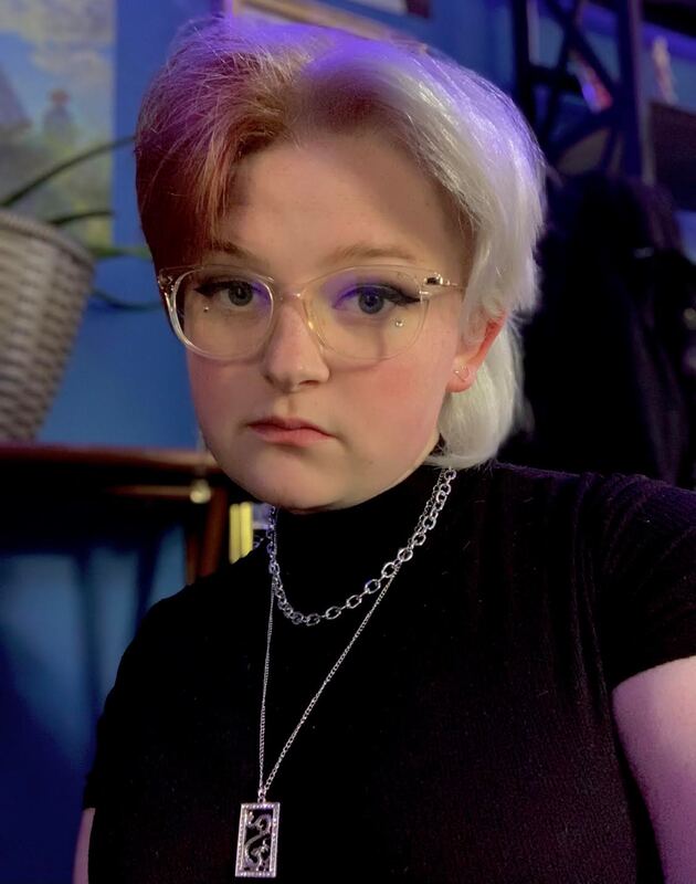
As a junior, Em. Condron tends to flourish with a vibrant personality as she experiments with many different mediums due to her mind that is always filled with crowded thoughts. Many of these thoughts are within watching her goldfish swim about with not a care in the world. Being able to advocate individuality and self love has always been a passion of hers, as she believes everyone should be able to express their inner personality.
Material used in series: acrylic paint, acrylic paint pens, watercolor paint, ink, glitter |
CONNECT ON SOCIAL MEDIA
Instagram @em_condron_rose
The Eyes
back
arranged here 40 x 20 inches
each eye is 30 x 8 inches
back
arranged here 40 x 20 inches
each eye is 30 x 8 inches
